Thursday, May 5, 2011

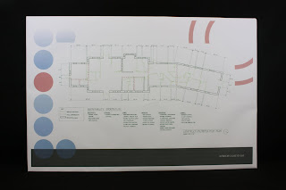
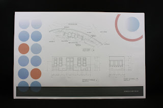
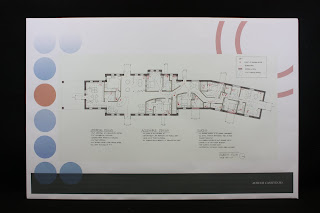
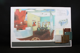
FINAL BOARDS - Depot Project


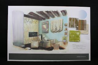
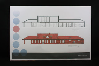
This is by far the best project I have done so far! I am so amazed at how much work I put into this project, I have never done so many plans off of one floor plan. I learned that sustainable practices are easy to use in a building. I tried to step out of my comfort level a little by using dark wood floors instead of lighter floors and it was a fun experience but I have a long way to go with getting it to work together. I learned how to manage my time well and what to give priority to while still keeping in with the quality of the project. I really enjoyed making this poster digitally in InDesign and realized that Sketchup wiring makes it so much easier to draw perspectives over. If I were to do it again, I would rethink the material selection in the living room and kitchen because I feel like I could find a better color combination in terms of a residence with a resident with visual disability. It was difficult to have a contrasting room without being too neutral and without going too far off of my concept. The best part that I had done, however, was the guest room; I absolutely fell in love with the guest room and the concept of an art hotel and how to merge art into a room without just putting a picture in the room. It reminds me a lot of just a heavily childlike themed room; it fits a lot with my hobby of making art so it was the most relatable part of my project and the most fun to create. I'm ready for more!

Friday, April 8, 2011

[Depot] Concept Development - Concept Model

Concept Model

Concept Model (side)

Concept Model (side)

3D Model (1)

3D Model (2)

3D Model (3)

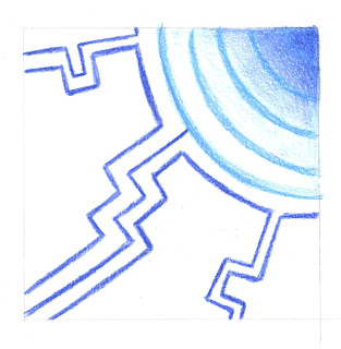
Final Parti

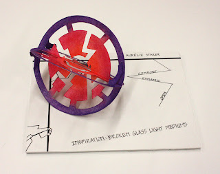
Inspiration struck when reviewing the many models that the Freshman class in the interior design program had done. I loved how many of the students had chosen to cut out patterns in their models and I thought it would go well with my "implied wall", closed but open, concept of my project. I drew from my inspiration and made two circles, then I took my parti's radiating lines as guides for the cutouts. I made each cutout different for visual interest and added color, orange in the center fading to purple on the outside to mimic a glow, since my inspiration deals with light. The models rocked back and forth on its sides and the cutouts were very dynamic. I learned some new techniques from the Freshman and tried to keep it simple while adding much visual interest. I am very satisfied with my model and feel that a good concept model lends itself well to a good design.

Textile

Inspiration Object Analysis Sheet

Sheet of Abstract Sketch Partis

Partis used for Patterns (Final on Left)

Final Pattern

Textile

Taking one of the concept model partis, I made pattern out of it by mirroring and rotating that one block and transferred that pattern onto an actual piece of fabric. The analogous color scheme (orange, red-violet, and red) made the pattern pop! Emphasis was given to the lines networking the pattern together. Through this process, I learned how easy it was to make a pattern and how many different ways you could make a pattern. Also, the strategic placement of color can make the pattern look different, bringing emphasis to certain parts or other of the pattern.

The textile that arrived LATE was actually not what I was expecting. I was expecting brighter colors and the pattern was done too big, the test sample I had printed out on the plotter was much smaller and more compact. I do like the fabric, however, and would like to work with Spoon flower again.

Tuesday, April 5, 2011

Sketchup Kitchen

This is my first time using Google Sketch-up and it is a very user-friendly program! This is what my Grandparent's kitchen would look like from my final last semester. I adore the apple martini quartz countertops! This has made me want to download the program onto my laptop so I can instantly visualize my thoughts and ideas of interior spaces!

Wednesday, February 23, 2011

Arne Westerman


This is a presentation on a regional artist, Arne Westerman, who is a native-born Oregonian. I chose his work as my inspiration for my upcoming design of the depot-to-B&B-and-residence. What caught my attention was the attention to emotion and moments in life that pass us by. He does not draw a portrait but emotions and thoughts, times when we stop to look at something that intrigues us, even if for only an instant. Being an artist, I strive to better my art and to create something that can make people think and inspire them. I loved the creamy colors, the way light is always in the picture, the way his paintings evoke memories. I hope to take into account of the lessons he gives through his painting and apply them to my design.

Depot Poster

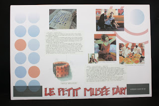
This poster was formatted by another member of the group, and so the layout is not completely mine. This was a case-study involving a depot that was adapted and reused as a Chamber of Commerce for Hammond, Louisiana. I found out that it is not a good idea to tilt pictures because it pixelates them so much, so I will never do that again. But I am satisfied with my layout.

Tuesday, February 15, 2011

Vision Disability Ability Workshop


For this workshop, everyone was paired in twos and sent to accomplish different tasks. When we looked through the plastic bag, we found that we could not read the newspaper since the print was too small (represented 20/60 vision). When we folded that plastic bag in half and looked through it, I could not see a thing. Everything was so blurry that you couldn't tell what anything was.
When looking through the vision simulator tool that displayed different types of vision impairement, I learned that there are more than one way someone can be impaired visually.
The elevator access in the Bookie was tucked away in the back so it was difficult to find. At the ATM machine, the first machine had a barrier to block other people's vision and it was difficult to see from lack of light but the red, black, and green color codes helped a lot. The card slot also blinked with a green light making it easy to see. The second ATM machine had an easier-to-read keypad. The stairs in the atrium were easy to find with the black strips at the end of each step but I did not feel safe and comfortable because the entire room was white and I think there was no rail on one side of the stairs, which caused me to grip the rail tight! But the contrast helped a lot.

I believe, from my many observations, that the built environment should be accessible to everyone. These sort of problems that arise from a poorly built environment can cause confusion, injury, and even death. New technologies like motion-sensor and audible/visually-stimulating signs are making the world more accessible.